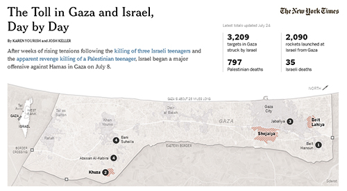
The "Daily Tally" in the New York Times, a casual-sounding infographic, presents a side-by-side count of casualties and missiles in Gaza and Israel. Although it is ostensibly one of the clearest representations of violence, it is seriously misleading.
War photography can be powerful, moving, and shocking; and data to prove a point can be reassuring, if often falsely. It is the very power of numbers, graphics, and photographs that makes them at the same time compelling ways to prove a point, and lousy ways of explaining what is really going on.
During World War II, it is estimated that 378,000 German civilians were killed in British air raids, compared to only 62,000 British civilians killed in German air raids. Knowing this, however, does little to help understand the nature of the conflict.
The New York Times's Daily Tally is as political as the map represented in it. The visualization quantifies two elements related to the conflict: the number of deaths, and the number of attacks. It does not reveal who started the latest round of battle or why; who the dead are; how many civilians live under constant threat of indiscriminate shooting, or how that number accumulated over time. The numbers simply attempt authoritatively to represent an amount violence in the air, devoid of all context.
 The New York Times "Daily Tally" infographic is seriously misleading, its numbers devoid of all context. (Image source: Screenshot of nytimes.com) |
Karen Yourish and Josh Keller, its authors, refer to these hostilities as another volley in the "Israeli-Palestinian Conflict." They could just as easily, and more accurately, have framed the events as, "the conflict between Israel, Hamas and its Palestinian hostages." I suggest this as a title because it signals to viewers that this conflict is more nuanced than the black-and-white conflict presented. Most Palestinians might even reject Hamas's aggression towards Israel: a 2013 survey conducted by the Ramallah-based organization, Arab World for Research & Development wrote that 65% of Palestinians opposed a new intifada, 95% of Gazans supported a new round of elections, and 44% of Palestinians preferred the Fatah approach.
The Daily Tally, favoring a more simplistic formula that implicitly frames the conflict as one between good and evil, obfuscates these distinctions. It also neglects to inform readers that as many as 70% of the Israelis support a Palestinian state backed by the UN, according to a survey done by Hebrew University's Harry S. Truman Research Institute. Instead, the Daily Tally simply demands to be frequently refreshed -- counting the dead while ignoring the demands of the living.
Maps, images, and infographics can, of course, easily become the instruments of promoting particular political ideologies, and might even have been chosen for that reason. By choosing to represent only particular aspects of a story, however, the people who post the Daily Talley know they are capable of swaying opinion and motivating viewers to think about a situation in a particular way. But that is not "all the news that is fit to print;" that is propaganda.
Creating compelling clickbait in the form of infographics is a disturbing trend in news today. Journalists would be more credible if, instead, they were even interested in embracing a more complete approach to communicating authentic stories, rather than competing for the bloodiest image. It would be refreshing if journalists would recommit themselves to promoting the truth, as closely as they could, behind the images and numbers they present. In promoting this partial and often false knowledge, it is easy to inculcate a misguided sense of righteousness on both sides. In the search for truth, infographics, images, and numbers give only the illusion of knowledge. The real thing often looks quite different.
Gil Lavi is a writer and former Middle East news photographer who focuses in his work on the research of images, maps and graphics from the Middle East.


